TL;DR
A DESIGN.md file at your project root teaches AI agents your design system in plain language. Once you define colors, typography, components, and spacing rules, every interface your AI agent generates follows them automatically—no more generic blue buttons or inconsistent layouts. Works with Claude, Cursor, Copilot, Gemini. Takes 10 minutes to set up, saves hours of refinement.
Ever asked Claude, Cursor, or Copilot to design an interface and gotten that same generic result? That blue that doesn’t match your brand. Those rounded corners with no identity. That layout that screams “AI-generated template.”
It’s not the model’s fault. It’s that you’re negotiating with it through loose prompts. Every request is a blank slate. The model doesn’t know the blue you chose last week, doesn’t remember your 8px corner radius convention, can’t infer your spacing system from context.
DESIGN.md fixes this. It’s a file that lives at your project root and teaches your AI agent how to design. Not through code. Through plain language instructions that any LLM understands.
Once you create it, every interface your agent generates follows your system automatically.
What Is This DESIGN.md Thing
DESIGN.md is a simple markdown file that lives at the root of your project and describes your design system in natural language. It’s not a 50-page branding document. It’s not a PDF style guide nobody reads. It’s an operational file that language models can interpret and follow — and here’s the magic: they don’t just follow, they internalize.
The concept was popularized with Google Stitch, but the truth is it works with any LLM: Claude, GPT-4, Cursor, Copilot, Gemini — any model that receives structured context.
In practice, the file defines what other code files define, but in clear Portuguese. Colors, typography, spacing, components, states, composition rules — everything described in markdown readable by machines and humans.
Why This Works So Well With LLMs
Most developers throw loose prompts to create interfaces. “Make it look modern”, “use a clean design”, “make it professional” — and they expect the AI to guess what they mean. It doesn’t work that way.
The problem with loose prompts is that they don’t persist. Every new conversation or every new file you create is a blank page. The model doesn’t know you created a blue button in the previous file, doesn’t know the corner radius is 8 pixels, doesn’t know the spacing between elements follows a 4-pixel scale.
But when you have a DESIGN.md at the root of the project, the model loads this context automatically. It knows “primary button” means blue background #2665fd, 8px rounded border, Inter semi-bold text. It knows “input” has a 1px border with secondary color. It knows what to do without you having to explain again.
This isn’t about passing visual tokens. It’s about passing design intent. The file doesn’t just say “how things should look”, but “why they should look that way” and “how to maintain this consistency over time”.
The Real Problem It Solves
Have you created a project with 5 pages where each one looks like a different planet? The landing page has one blue, the dashboard has another. The buttons use different sizes, the titles use different fonts, the spacing is random. It looks like that Frankenstein project you inherit from a developer who doesn’t document anything.
For a solo builder creating a micro-SaaS, a landing page for a client, or an internal dashboard, this kind of inconsistency kills product perception. You may have the best backend logic, the best automation flow, but if the interface looks amateur, people don’t trust. And more: they don’t pay.
DESIGN.md solves this simply. It transforms design from something you “do by hand” into something the operating system of your project understands. From the moment you define the rules, every new interface created by your agent follows the same pattern. Automatically. Without you needing to supervise every pixel.
Why Natural Language Is More Powerful Than Isolated Tokens
You could define CSS variables. You could create tokens in a design token file. Why not do that?
Because isolated tokens don’t convey context. A token file says “primary: #2665fd” but doesn’t explain when to use, in what context, with which combinations. DESIGN.md says: “Primary for CTAs and active states, Secondary for supporting interface, chips and secondary actions”. Each token has a reason to exist and a right place to be applied.
Furthermore, natural language is what the language model understands best. It was trained to understand text, not to parse JSON tokens. When you write “rounded buttons with 8px radius, the primary one uses primary color fill”, the model understands not just the rule, but the visual hierarchy.
And finally, the file evolves. You don’t need to be a designer to create a decent DESIGN.md. You can start simple — colors, typography, buttons — and add rules as the project grows. It’s a living document.
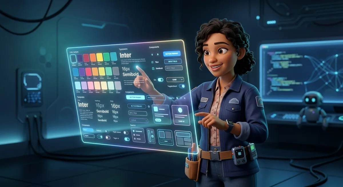
What A Structured DESIGN.md Looks Like In Practice
You don’t need to invent from scratch. A functional DESIGN.md has clear sections that cover everything a model needs to know to create consistent interfaces.
Colors
# Colors
- **Primary** (#2665fd): CTAs, active states, main interactive elements
- **Secondary** (#475569): Supporting interface, chips, secondary actions
- **Background** (#0b1326): Page backgrounds
Typography
# Typography
- **Headings**: Inter, semi-bold
- **Body**: Inter, regular, 14–16px
- **Labels**: Inter, medium, 12px, uppercase for section headers
Components
# Components
- **Buttons**: Rounded (8px), primary uses primary color fill
- **Inputs**: 1px border, subtle background with surface variation
Spacing
# Spacing
- 4px grid as base unit
- Margins and paddings in multiples of 4 (4, 8, 12, 16, 24, 32, 48)
- Default 16px gap for component grids
States
# States
- **Hover**: 0.8 opacity or 10% color shift
- **Active**: 0.98 scale
- **Disabled**: 0.5 opacity, not-allowed cursor
- **Focus**: 2px border in primary color with offset
Anti-patterns
# Anti-patterns
- DO NOT use primary color for extensive backgrounds
- DO NOT use more than 3 background colors per page
- DO NOT mix different font families
- DO NOT use thick borders (> 2px) on small elements
Composition Rules
# Composition Rules
- Use grid for multi-column layouts
- Use flex for aligning related elements
- Maintain aspect ratio on images
- Ensure minimum 4.5:1 contrast for text
Start with three sections: colors, typography, basic components. Use natural language, as if explaining to a human designer. Ignore what you don’t know yet — you can add later.
How This Transforms Design Into Real Leverage
A solo builder who masters this file has a concrete advantage: can generate entire frontends while maintaining consistency without opening Figma. Need a new page? Ask Cursor or Claude and they’ll create it respecting everything you defined. The new page will look like it was made by the same person who made the others — because it was. Or almost: it was made by the same intelligence, with the same rules.
For micro-SaaS, this changes the game. You can have an MVP with a real product look, not a prototype. This affects perceived value, willingness to pay, user trust. A dashboard that looks professional has a better chance of retaining users than one that looks amateur.
For landing pages, the advantage is identity. You can create 10 page variations for A/B testing without any of them looking like they were generated by AI. Each follows the same visual system but with different compositions. The user doesn’t notice, but conversion does.
For prototypes you want to “sell” to a client or use as market validation, having a professional-looking interface makes the difference between “let’s validate this” and “this looks serious, let’s invest”. A well-presented prototype closes more partnerships.
For internal dashboards, visual clarity impacts operation. Less confusion, fewer user errors, less time explaining how things work. The operationalized design system makes life easier for users and maintainers.
DESIGN.md As Persistent Memory
The file doesn’t just serve to create new content. It serves as the project’s design memory. When you return to the project two weeks later, you don’t need to reread your old prompts. DESIGN.md is there, intact, telling any agent entering the project how things should be done.
This is especially valuable in long-term workflows. You can pause a project for months and return without losing visual identity. You can add new team members — human or artificial — and they’ll understand the context simply by reading the file.
The file’s evolution is natural. When the project grows, you add new sections: dark and light modes, accessibility rules, animation patterns, image guidelines. The file accompanies the product’s maturation without you needing to redesign anything.
And most interestingly: you can create reusable templates. A well-structured DESIGN.md that works for one project can serve as the base for the next. You don’t start from scratch every time. Your visual identity becomes an asset you transport between projects.
The Practical Difference
Throwing a loose prompt versus having a persistent system isn’t a matter of degree. It’s a matter of type.
Without DESIGN.md, every new prompt is a negotiation. You try to describe what you want, the model tries to guess, the result is a compromise that rarely satisfies. You iterate corrections, spend time refining, and even then the final result looks generic.
With DESIGN.md, you establish a contract. The model knows what to do. The chances of getting it right on the first try are much higher. The time you’d spend refining prompts you spend doing something that adds real value. And the result is consistent.
For a solo builder, time is the most limited resource. Every hour saved on refinement is an hour invested in building something that adds real value. DESIGN.md isn’t just about beautiful design. It’s about consistency, speed, standardization, and the ability to scale interfaces without chaos.
How To Create Yours Now
You don’t need a complete document to start. You can create a basic one today, in ten minutes, and refine as you use it.
Create the file at the root of the project. Name it exactly
DESIGN.md.Start simple. Three sections: colors, typography, basic components.
Use natural language. As if explaining to a human designer.
Test. Ask your agent to create a button or card using the file as context. See what happens.
Refine. Over time, you’ll have a system that works for your style and your projects.
This simplicity is the point. It’s not about having the perfect document. It’s about having persistent context that works. High practical impact, low implementation cost, great leverage for who builds alone.
FAQ
Does DESIGN.md replace a complete design system?
No. It’s an operational starting point that evolves as the project grows. For larger projects, you can expand to include formal tokens, theme variations, and component documentation.
Does it work with any AI tool?
Yes. Claude, Cursor, Copilot, Gemini — any LLM that receives file context can interpret and follow the rules defined in DESIGN.md.
Do I need to know design to create one?
No. You can start with the basics and evolve. The usage experience itself will show you what to add.
How do I keep the file updated?
Treat it like code documentation. Add new rules as you create new components or establish new visual patterns.


